Staged To Sell
Staging is an essential and often undervalued marketing tool when selling a home. While your space might be perfectly suited to you, it may not appeal to a wide range of potential buyers. Thus, your objective in staging is to create a clean, hip, yet relatively generic space devoid of clutter. You want the space to be inviting and flexible so the buyers can envision themselves living there. This is not about creating a comfortable space, per se, it’s about illustrating the proportions of the rooms in an artful manner.
This may require a bit of organizing and a style update.
We like to stage apartments by creating a clean, neutral space and then setting the mood with pops of colorful accessories. This allows for flexibility in the design strategy – you can change the character of a room by swapping out the colorful decor.
Here are our fool-proof tips to styling your space!
PREPARE YOUR CANVAS
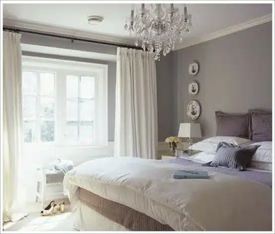
- The Perfect White: Not all white rooms are the same. There is a vast array of white shades, all with various hues that will interact with the light exposure and change the character of a room. A little known design trick is to mix two Benjamin Moore paints: 50% Decorator White with 50% Linen White. Decorator white has a cool undertone, and linen a warm one, so together they create a perfect, not-quite-white color that is endlessly versatile.
GOOD FOR: Rooms with a lot of southern exposure light, rooms with built-in bookshelves and cabinets, rooms that have deeply colorful furniture.
- Cozy Grey: It is commonly thought that a dark room – or one with northern exposure – needs to be painted a very light color to brighten it up. This is a classic mistake, as the bluish tone of northern light will end up casting huge, muddy shadows on a white or beige wall. Instead, opt for color saturation even if you remain neutral. Antique Pewter has the perfect saturation with a warm undertone to absorb the blue shadows. It looks modern without being harsh or industrial, and pairs perfectly with wood mid-century furniture.
GOOD FOR: Rooms with northern exposure or low light, and it provides a modern contrast to wooden furniture.
- Warm Wheat: I was once told that the best colors are those you can’t really put your finger on. Bluish grey, yellowish-orange, pinkish-red. A perfect, neutral color that is not quite yellow and not quite tan is Desert Tan by Benjamin Moore. In bright rooms it will look like a soft, wheat yellow with just a hint of red undertone, and in darker rooms it is saturated enough to absorb blue hues. On cloudy days, it’s buttery and soft and when the sun is shining, it’s light and cheerful. It’s a perfect chameleon color as it looks great any time of day and is very flexible with accents.
GOOD FOR: All rooms, all light exposures. Particularly cozy in the winter with candles. Looks great with a deep, Moroccan red rug.
NEUTRAL FURNISHING
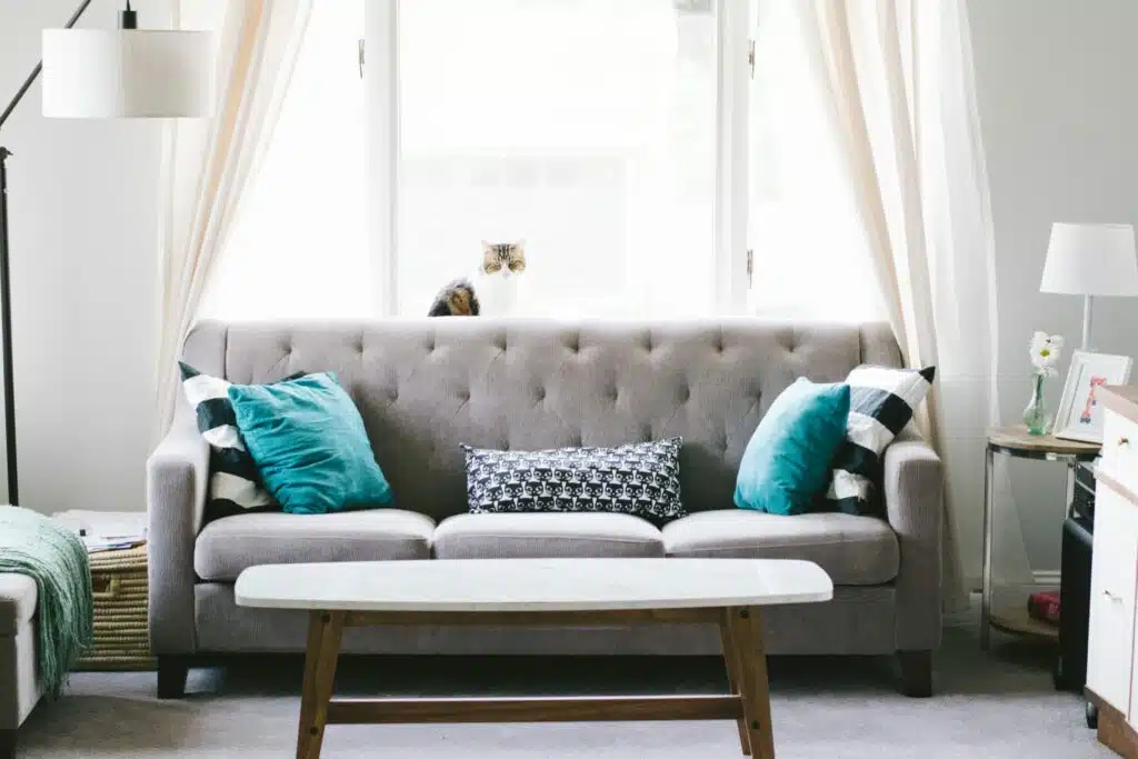
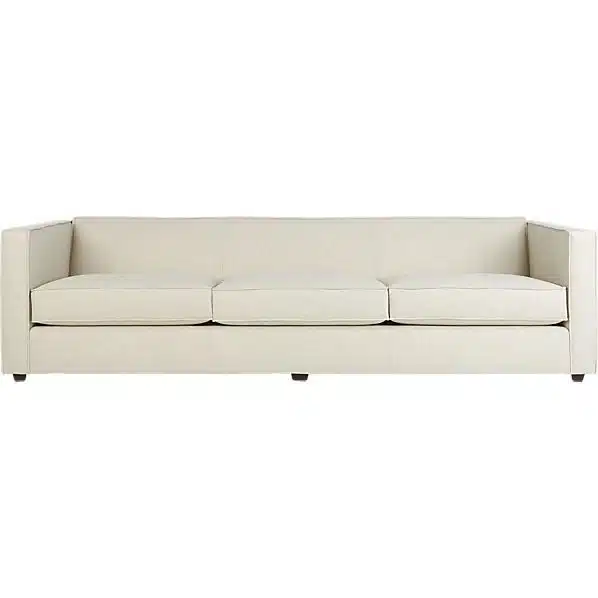
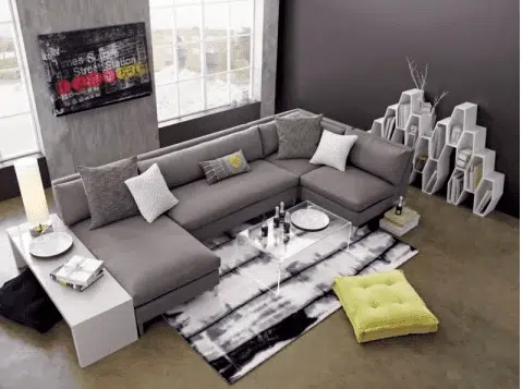
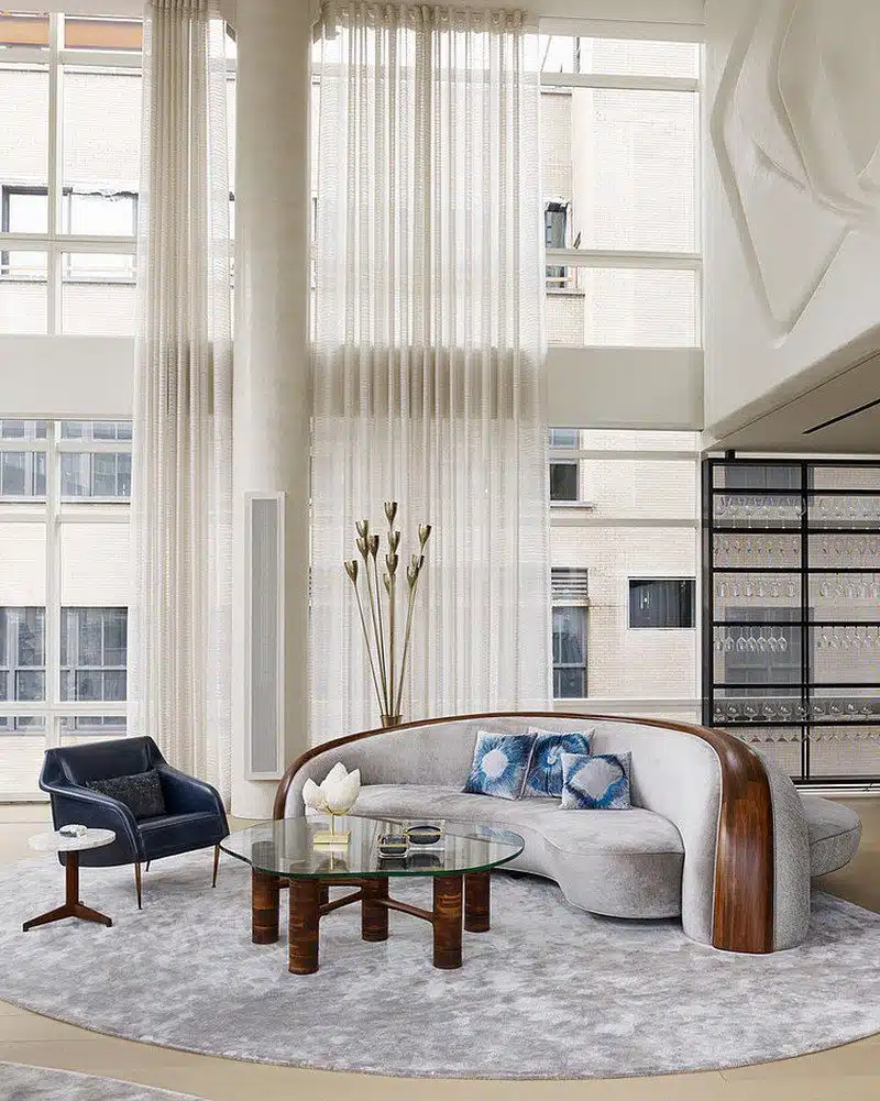
- Seating: Think clean looking, not necessarily comfortable. For example, a big gushy couch is nice to sit on but it might not produce the right effect for viewing. The CB2 couches pictured in the gallery have clean lines without the harsh, angular look.
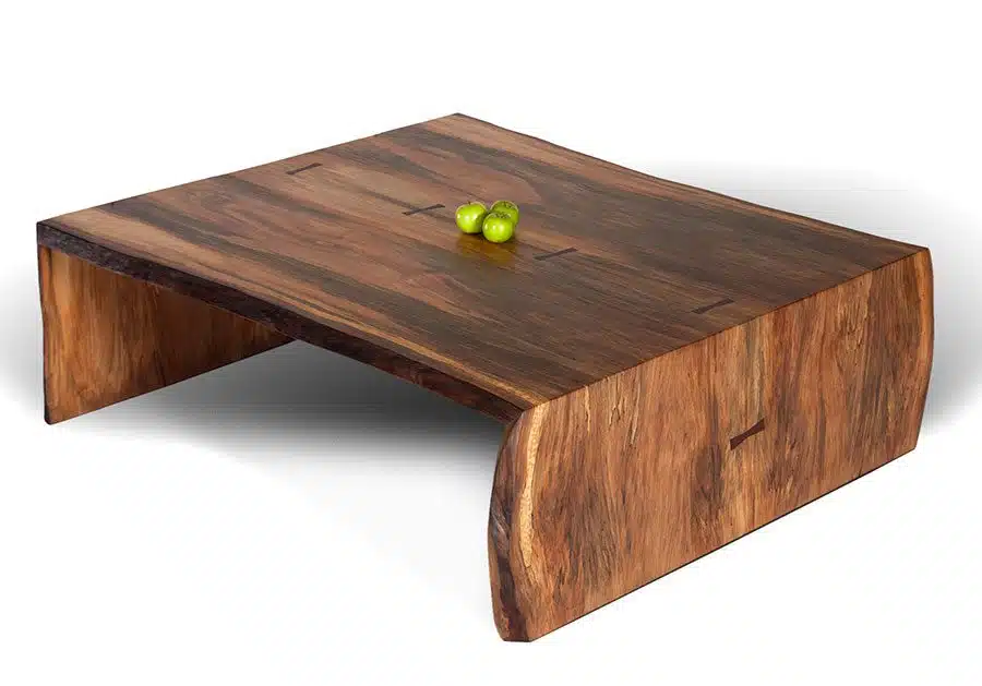
- Tables: Low coffee tables make the room look bigger, and the side tables should be fairly minimal. Avoid ornate carved wood or anything fussy.
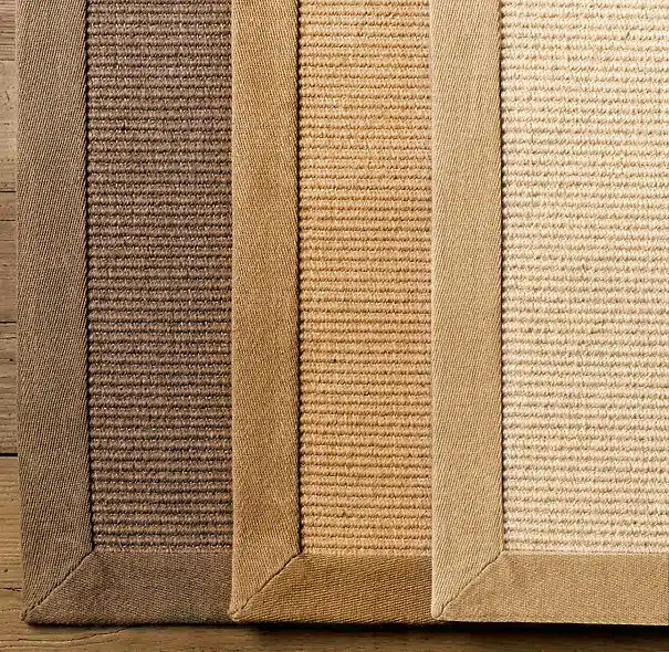
- Rugs: Sisal rugs are perfect for adding an organic, textured touch while maintaining your neutral theme.
- Curtains: White and semi-sheer curtains are a nice contrast to any room color, and look beautiful with light pouring through them. Make sure they are clean and ironed.
- Linens: White, crisp, ironed. Never use ivory sheets, as the yellow undertones easily look dingy. A light, crisp light grey sheet set is also a possibility.
FUN WITH ACCENTS
Now that you have prepared your blank canvas, you can get creative with colorful throw pillows, throw blankets, vases, and the like. Get creative! You can’t go wrong at this point. Here are some ideas to create texture in your neutral space:
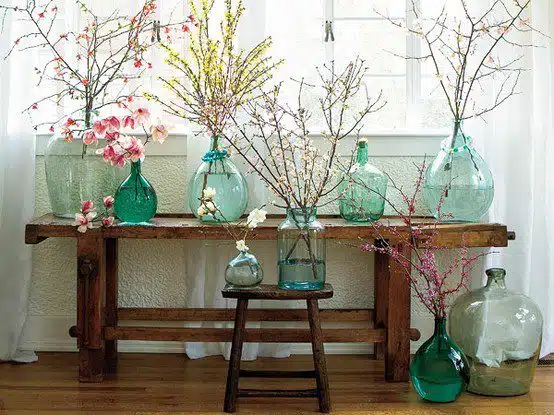
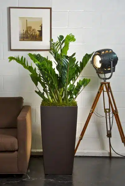
- Wildlife: Organic material will create a sense of life in the space. Greens are fantastic for bright spaces, and vases full of beautiful branches or willows will work when there isn’t enough light. ZZ plants, pictured below, are lush and dark green and require minimal upkeep. Give them a thorough soaking once ever 10 days.
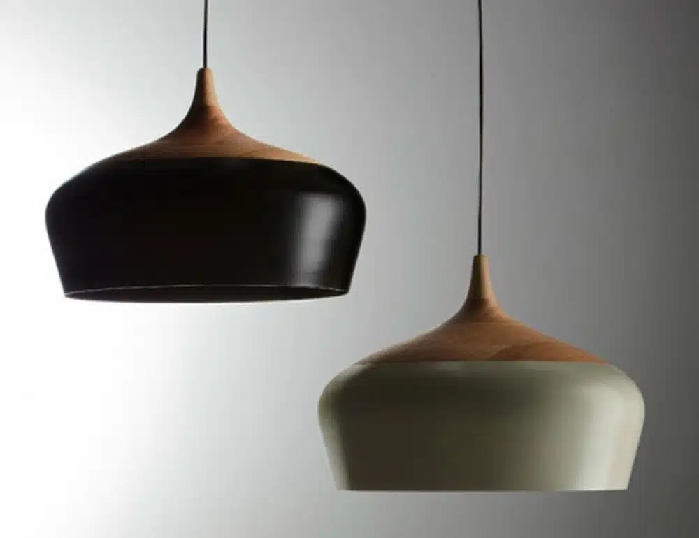
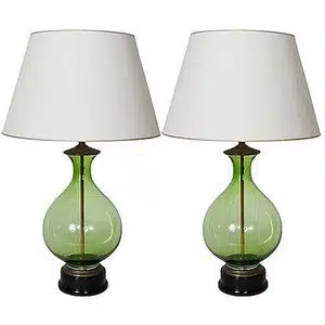
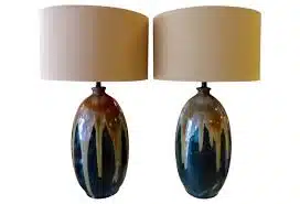
- Lighting: Midcentury modern lamps and contemporary light fixtures are all the rage right now. We love clean lines, mixing wood with metal for an organic modernism feel. Repurposed antique glass seltzer bottles add a ton of character too.
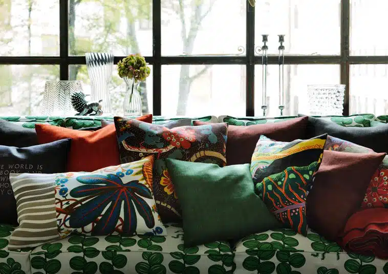
- Soft Touches: Pops of color work wonders! These pillows from our favorite Scandinavian design shop, Svenskt Tenn, are vibrant and engaging. The original textile was designed by Austrian designer Joseph Frank in the 1930’s, and they still manage to be modern to this day.
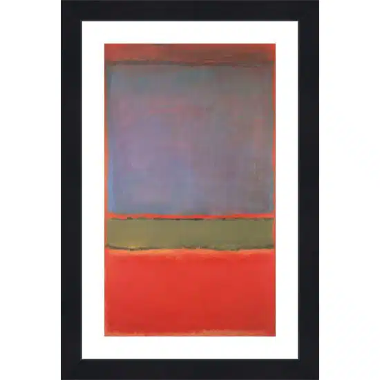
- Art: Bright, Rothko-style pieces. Stay away from figurative art. Large scale, monochromatic prints and photographs with high color saturation can complement a beautiful throw blanket laid over the couch.
Staged To Perfection
The bottom line is that your home needs to lend itself to the imagination of the buyers. You may love the life size portrait of your beloved cat, but that may limit how others view your home. Put personal items away, make sure your rooms look clean and fresh and add character with those limited pops of color. Your home will sell before you know it!